QUEST ANALYTICS
Role: Product Designer (SaaS Web application)
responsible for Research, Design System Creation, Ideation, Testing, Implementation.
OVERVIEW
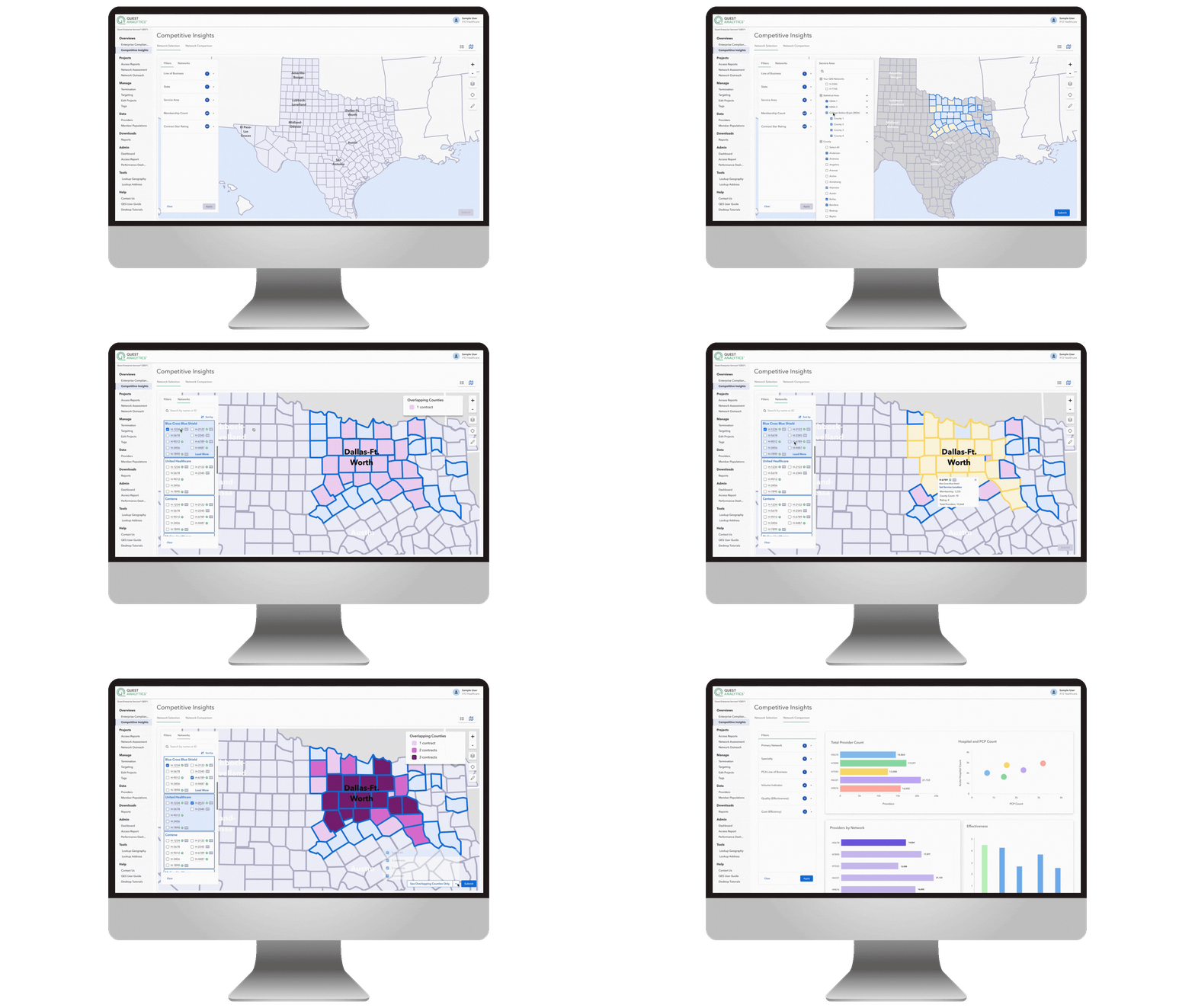
At Quest Analytics, I designed and launched a new mapping feature that empowers clients to visualize healthcare provider networks more intuitively. This feature was critical for helping clients analyze network adequacy, performance, and provider distribution at scale.
My role involved leading the design process from initial sketches to validated high-fidelity prototypes, collaborating closely with product management, engineering, and end users along the way.
PROBLEM
Clients needed a way to quickly and accurately understand provider network coverage within specific geographies. Existing workflows required multiple steps, making it difficult to spot gaps or validate network adequacy efficiently.
The challenge:
-
Make the mapping feature intuitive enough to be usable during high-stakes analysis.
-
Ensure it was lightweight enough to avoid performance issues given the massive data sets involved.
-
Validate that the feature delivered on the real-world needs of clients across the U.S.
PROCESS
1. Early Exploration
I began with a brainstorming session to explore hand-drawn sketches mapping out possible interactions and flows. These low-fidelity explorations helped me and product management quickly align on key objectives: clarity, speed, and flexibility in viewing network coverage.

2. Wireframing
Moving into wireframes, I iterated on layout and interaction patterns—balancing the complexity of provider data with usability. I ran multiple reviews with product management to refine feature scope and functionality before investing in visuals.


3. High-Fidelity Prototyping & Iteration
I transitioned into high-fidelity wireframes, where I tested different visualization styles and layering techniques. During this phase, I partnered closely with engineering to evaluate technical feasibility and performance impact.
-
For example, certain design choices had implications for rendering speed when working with large data sets.
-
Through collaboration, we adapted the design to meet performance needs without sacrificing user experience.

4. Testing at National Summit
The prototype was tested with clients during a national healthcare summit, giving us direct feedback from end users. This allowed us to validate:
-
Was the feature intuitive?
-
Did it include the functionality clients expected?
-
Did it streamline workflows compared to previous methods?
This testing confirmed the design met client needs and surfaced opportunities for minor refinements before final delivery.
OUTCOME
The mapping feature delivered measurable improvements for both clients and internal teams:
-
40% faster workflows: Client teams were able to complete geographic coverage analysis in nearly half the time compared to previous methods.
-
30% reduction in support tickets related to network visualization, indicating the feature’s improved intuitiveness and ease of use.
-
High adoption at launch: Within the first quarter, over 75% of active clients incorporated the new mapping feature into their workflows.
-
Positive client feedback: Post-summit surveys showed a 4.6/5 satisfaction rating, with users noting the clarity of the visualization and time saved in validating network adequacy.
These metrics validated the design approach and demonstrated tangible ROI, positioning the mapping feature as a core differentiator in Quest Analytics’ product offering.