What is Tutoria?
Tutoria is a web platform connecting seekers of knowledge services with volunteers eager to make a difference. It features programs preparing clients for the US Naturalization Exam and helping non-native English speakers practice conversational and/or written English with a tutor.
What is the problem?
The current design iteration of the volunteer dashboard is very bulky and repetitive in its content. There are multiple avenues to get to the same page and pages that repeat the same content in different areas. This can make it difficult for users to review and make changes to their schedule or hours previously input for the week. It is also difficult to find where and how to send a new message since the existing platforms takes you to a new page without much guidance.
Design Process
USER FEEDBACK
We gathered user feedback after testing of the previous iteration and saw the same pattern in pain points and barriers show up interview after interview. Users were having a difficult time initially figuring out the system and subsequently figuring out the quickest route to take to accomplish a task.
Misclicks at
24%
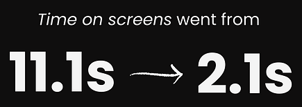
Average time spent on a screen:
11.1s
The results from previous user testing show a 24% misclick rate, which is unusually high. The average time spent on a single screen deciding where to go next is 11.1s - while this isn't exceptionally high, we'd prefer to be at 2-4s to indicate easier usability. These longer screen times and higher misclick rates can lead to frustrated users and, subsequently, loss of users. This led me to create a few goals for the next design iteration.
Goals
-
Edit content to cut out any repeating information and decide the best place for it.
-
Give users less options to make their decisions easier and faster.
-
Adjust the interface to include less content so that it is not as challenging to look at.
USE CASE

Motivation & Drivers:
-
They want a streamlined way to enter information and be able to edit in the same area if needed.
-
They want clearer call-to-actions guiding them across the interface.
Pain Points:
-
There are multiple avenues for them to be able to enter the same information, making it harder to learn the system in the beginning.
-
New pages are continuously being brought up rather than keeping everything on one page, making their to-dos take longer than they need to.
Barriers:
-
Too many options.
-
Unable to effectively navigate the interface without guessing where it’s taking you.
The Design
The design was focused on adjusting the key features volunteers were utilizing day-to-day: schedule creation, hours input, and messaging with clients. I made sure to edit down the existing content so there wasn’t so much being repeated on different screens. Some of the status buttons were not ADA-compliant so I made sure they were in the new design.
Out with the old...


In with the new...


The Results
The first problem I needed to tackle was figuring out optimal pathways for the inbox and timesheets. Previously, the user was getting to these 2 areas via the Match screen rather than the navigation bar at the top. I decided to get rid of these sections on the match cards so the user would know to use the navigation bar to get to these areas. Additionally, once the user was on these screens, they were repeatedly taken to new screens for next steps. I wanted to limit screen loading time and improve efficiency for the user so I made sure to be able to complete all tasks on one screen for both the inbox and timesheet.
For the inbox, the user is now able to view all messages with clear indicators of what has been unread. They are now able to reply in the same area they look at their messages and can see previous replies if needed. For the timesheet, I worked with our business teams to get approval to remove separate timesheets for each client and create a general timesheet for the volunteer to keep track of their hours. Everything is now able to be edited and saved on the same page creating better efficiency for the user.
The matches screen had a significant amount of content edited out since a lot of what was on it was not needed by the user or could be found elsewhere. This helped to make the cards easier to read since only pertinent information remained. Rather than having to-do sections on each individual card, I created a to-do section at the top to let the user know any messages that were unread or any timesheets that needed to be completed.
XFN Collaboration: Throughout the duration of this project, I had weekly meetings with the engineering team to figure out what was feasible for production. Prior to getting started on the designs, I asked the team what problems they encountered the first time to ensure those problems weren't replicated in the new design iterations. I continuously made adjustments based on engineering's feedback and we were able to start production much faster due to our constant communication.
Final testing revealed...